There where challenges and things I had to learn, such as the way to improve my work and fill my skill gaps.
I found my most obvious skill gap was my lack of knowledge on animating only digitally and not from pen and paper then advancing to computer programs for editing.
In doing this I needed to increase my understanding of Flash animation and other digital animation programs. I also learned to improve my digital drawing and animations technics.
My first animation was also filling a skill gap in integrating 2D and 3D animation, this was a test as I had never done this before and as a first time still needed a lot of improvement but my topic was changed and I began to concentrate more on what was important.
My original knowledge of flash animation was very basic, I knew about making keyframes and drawing with the pen tool. But threw this year I have learn about changing the layers property to effect the others layers, for example burn layers or overlay. changing opacity and frame size as well as the advantages of creating symbols and why they are so often used. The stylized Cinderella animation uses the majority of these flash tools, especially layer effects to give a overlay of a soft paper technic.
I Researched common animation technic used in animations then tried most of them my self to see how effectively they work.
one of the first things I researched was why shows liked loony toons use smudge/zip lines in animation, There are where a Characters body zips out of a scene or quickly grab an object in one or two frames of animation. This is used to save time in animation and make the movement higher passed and comical by using less frames it also save animators time rather than drawing a person walking on and off screen.
I did thing in my animation of a girl picing up coffee and It was proven very effective and good practice as animating digitally, this only took me one day to animate and had respectable results.
Japanies animations (or anime), substitutes movement and animation for high detail background and characters only animating what is necessary, majority of the time this is all driven by speech rather than movement They also use the graphic novels there shows are based of of as a beginning to there story board and lay out. Following there's rules I animated a comic strip from one of my Favorite graphic novels using movement only where I thought it was necessary.
The next challenge I faced in my project was coloring an animation in a stylized manner, as-well as finding a way to paint this style digitally.
My style was chosen to be a light pastly colors with a chalk/water color texture for my two main male character and scribble pen for my wolfs.
I followed Photoshop tutorials on how to remove my hard edges and make my work look more organic like chalk and water color.
this was my result. How ever this took a long time so I tried this again but taking shortcuts to make it more realistic for animation.
After doing more research I found that I would be unable to color my characters like this on flash, however Photoshop cs6 had a time line much like flash. I learned how to use this tool in the newest Photoshop but it was unfortunately not as useful as I had hoped as I had to still render it all together in flash or premerpro. However this was a first for me animating in color and I fond the Photoshop time line useful to see errors ahead of exporting.
All together I feel more confident in my skills with flash, a program I was organically intimidated and infuriated by I now find more enjoyable. this has helped my improve my digital 2D animation and techniques used to some time and improve its quality. how to color with a more natural or traditional look on Photoshop coloring animations using Photoshop time line and collaborating them all in to my final animation.
Saturday, 11 May 2013
Thursday, 18 April 2013
Basic animations : Review and Feedback fixing
01
Make the fether Off screen befor he gets up.
More shake on the branch More preparation to push branch up.
Run and Hide Behind first tree get ride of the pause
Have feather spin round him to stop in the ground more naturally (Updated feather spins round him now)
More scaird and clumsy run. Longer time seeing wolfs head
wolf smaller to stop the tail from being cut off screen
zoom out more to help wolfs porportions Add more ups and downs to run.
Cut hand slighly quicker to line up with next scene
(newest eddit zoomed out)
(Newest eddit wolfs triping)
needs more frames for turnarownd for more struggle.
Reusable wolf run.
All together in timing.
Friday, 5 April 2013
NEW New animatic
Concept art:
Good but need to think more about how lighting will atchily effect the envirom ment. maby more hilights here and there with more detail.
It was also sigested t add a vignette (shaded edges) maby with a charcoal texture to help with an eirre feel.
(this is a Vignette I didn't know that till now haha)
Positive And Negatives of Photoshop timeline cs6
I have been playing with cs6 photo shop as I was told it has animation sketchers much like flash and time lines. This was a Grate help as I want my animation to be sylised and sketchy this would save time in production jumping back and forth from flash to photoshop. Make sure the frame arnt so jump and so on.
How ever when looking at CS6 I notes some complications.
The possitives are:
How ever when looking at CS6 I notes some complications.
The possitives are:
- Much more painting options than flash
- Im more comfortable drawing in Photoshop than flash
- can Import music
- Basic production animation add-ons, eg. dip to black, cross fade ext.
But the Negative are:
- Hard to flick between
- frames do not have onion skin (but can get around with layers and opacity)
- Eatch layer is a frame of animation (thats a LOT of layers, may cose slow prosesses and need good orgnisation)
- Difficult to eddit the time line
There may be more tatorials im still to find that will help with some of the ishus that I am having but from the tutotials I have seen, it looks like CS6 photoshop timeline is mostly for very basic animation. so I would be best makeing the basic animation in flash then clean up animation in Photoshop.
It still has its perks and shall be used. I was also thinking of using after effects for the glow on the falling fether.
So Programs being used so far:
- Photoshop CS6
- flash CS3
- Premier Pro
- After Effects (possibly)
Sunday, 31 March 2013
New story Fist take story boards and music
This is my new story based on symbolism and pressers felt by same sex couples.
(original consepts are good but to anime like and the blond boy is to young looking)
Fist take animistic.
Second take better with music more in timeing.
(original consepts are good but to anime like and the blond boy is to young looking)
(tryed to make blond boy older but still to anime)
(simplifyed style to get ride or anime feel also helps in style and characters more heavenly influenced by body language)
(the Enemys)
I did reserch in to common problums same sex couples face being together. and the most common where, Religious Ishuss, here represented by a snake, linked to the bible and what is considered a sin.
Society opinion, quick to laugh and mock but do not see the real pitcher, because of this I drew them as hyena shaped wolfs, sitting up right and bold, with no eyes to see but mouths to laugh.
Family Ishuss, this is based on the hunched over wolf the larges and most intimidating, it has large eye to judge.
Legal Ishuss, being seen as an american eagle at first, Protscting , regal and strong but slowly turns in to a volcher when you learn the legal system is not always on the side of same sex couples.
I desided to take out the egale in the end, because the main character also has a link with birds but in a more angilc and free meaning but this confused the audience. I also did not wont to give the impretion that this is somthing only for america or based there.
This was a practice with digital painting to see how I can paint a calky/water color looking drawing for animation. as this is the style I want for the to partners and the enemys to contrast with harsh black pen. as a first attemt this worked well but took a bit longer than planed. 2h for one frame? unrealistic.
Tried ageing later after I knew the steps to digitally paint but make it look hand drawn this only look me a min or so. This is the final character designs of my 2 main characters.Second take better with music more in timeing.
Saturday, 23 March 2013
Feed back
My feed back for my last presentation befor My Final and most impotent one was... alright I gess.
I Fallowed all the Advice given from the last pitch and planed what I would say made sure to memorise the names of animators and important names as memory is somthing I am week on. and completly changed my story idea.
However! I was extramly nervuse, shaky and offten found my self not saying anything when I had so much to say. My nerves got the better of me and I dont think this has happend befor...
none the less, the lecheres didnt seem to menten it in my feed back but I knew I was jumpy so I may need to practice keeping calm.
The feedback that was given how ever was; they liked the new direction and story and could see a clearer path for my thinking and ideas. However I should be carefull not to make my animation to symbolic so no one knows whats going on in the hole animation.
I also shouldn't mention things I have done previous to this, not because it isnt impotent but because in my final presentation this distracts from the main point I need to bring across in my final presentation.
They did like my new story and its powerful message. however they where unsure about the ending and was thinking that it should be something else like death... I was not fond of this as the last secen was ment to be a resolution and not a tragedy.
Wednesday, 6 March 2013
The link
The reason for my upload of Paper man is because I have found a Link in my research something that has always been there and concepts my research at the very beginning to just now.
Originally I wanted to focused my research on 2d-3d animation and how hybrid animation can be used effectively to enhance the animation. How ever this was a Fresh field of research for me and information to find on this was hard. But my main concept was to try and make 3D animation look as close to original 2D concepts as possible.
Paperman successively achieved what I was thinking of and hoping for. and in the videos it is also menchend keeping an image free and close to the original style of concept art and Medium.
and with my research on limited animation for television I was also arguing why children shows and movies aren't more influenced by there original concept art. The artwork of Cinderella was something that amazed me but there final animation looked nothing like the art they had made and this was very frustration that they would toss such nice besides and concepts. but it was understandable as it is hard to keep this kind of art style in proportion and with strong continuity with so many people working on it it had to be set to strict rules.
(I have notes on this back home I must add later)
Originally I wanted to focused my research on 2d-3d animation and how hybrid animation can be used effectively to enhance the animation. How ever this was a Fresh field of research for me and information to find on this was hard. But my main concept was to try and make 3D animation look as close to original 2D concepts as possible.
Paperman successively achieved what I was thinking of and hoping for. and in the videos it is also menchend keeping an image free and close to the original style of concept art and Medium.
and with my research on limited animation for television I was also arguing why children shows and movies aren't more influenced by there original concept art. The artwork of Cinderella was something that amazed me but there final animation looked nothing like the art they had made and this was very frustration that they would toss such nice besides and concepts. but it was understandable as it is hard to keep this kind of art style in proportion and with strong continuity with so many people working on it it had to be set to strict rules.
But ageing I was talking about the relativity of concept art to animation and why it doesn't exist. but the truth is it dose exist but in animation shorts. of all my previous research is still relevant but less focused on now what is my topic. being how dose medium and line effect the feel and movement of the animation.
I have been looking more in to short animation that use inserting styles and medium. here are a few i have found.:
Monday, 4 March 2013
Paper man
Bringing the gap I have been talking about with concept art and animations :
Wednesday, 20 February 2013
Presentation feed back
Due to Resent events, I will admit my presentation was not as preperd or professorial as i would have liked. My Dyslexia and stress of proforming made me forget a lot of names and information i know and make me look a lot less knowledgeable on my topic than I really am.
However this may sound like a sad point I will not let it bring me down and Learn for the Future, A list of important names and terms I may use wright down on Paper to help me on my way.
Along with that I did Received a lot of good information.
It was commented that my Animations and research looked more focused on the Aesthetic of the animation rather than limited animation for television. It seems my lecheres are worried that if I focused to much on budgeting and the limitations that are bright along with TV animation, that It will hold me back fir what i can realy do, as this is not chalinging.
It was advised that I maby concentrate more on aesthetic in animation than the limitations so I am more free to explore my topic. and even tho my research point has changed everything I have already Research is still valid and useful for me to continue.
I was hoping more to concentrate on the marketing and production as this it what i hope for as a future corer, it is true that this hold me back and i would be better with a much more inexpressive portfolio than numbers and figures.
So I am changing for a more artistic direction for I am an artiest and a animator, not a businessman or mathmatishion.
Much like the animated movie, book of Kell^ the art of the animation is based on the original book of kell. Showing how a visual style can help the apple and push the story.
It was also stayed that my story (with the milk) seemed a little cleshay, like he had already seen it befor. My story is not the most original, but I liked it Generic quality. However as i am now changing my Main Objective this story is not appropite for it any way.
They said they enjoyed the story with my Chess board characters more...However...I realy dont like the chess idea. The chracters yes but the story feels dry and ..bllah...
So I may agein need to find a New story... hmm.
Straight after my presentation I went to book stors to look at children illistraters whos styles inspired me, (I will add the list latter)
But whill looking I relised It is not a Childs storry I want to animate so logicly this kind of ilistration is the wrong thing to look at, but it was still good Reserch in to there style. why cant we have more stylised animations like childrens books but theamd for adults.
Saturday, 16 February 2013
Friday, 18 January 2013
Animistic: Last milk
To help with this I have been watching the Chase scene in ratatouille
(sorry for the odd Audio this was the best i could find on youtube to show you watch i was watching on my DVD)
From watching this I notist that the shots are normally further away to help the watcher know where the character is. and the Camera kept focusing on the Window exit to keep reminding you what his goal was and where he wanted to go, as well as showing you how much progress he had made running and how long he had till freedom.
Hopefully this will help greatly in my Re-draft of my storyboards, i am also hoping to do a floor plan at a latter date to help with the lay out and directions my character will be running in the store.
Thursday, 10 January 2013
Still struggling with a story,
I have got to a hard stage where finding a story fitting to what I want. I wanted something funny and simple. The characters also had to be dynamic and reusable to fit in with animation for television.
Much like the series of an animation on TV such as loony tunes with Bugs bunny and daffy duck. The character can be placed in to any environment and scenario and preform there story with out the Audience asking how or why they got in to this situation.
For help coming up with story I used the word salad to brainstorm an idea. here are them main pages I likes the look of most:
I decided on the Final Drawing Idea or two people fighting over the last bottle of milk in a super market.
I also had the Idea of it being two superheros fighting over the milk in there very day life's when they are not being super hero's. How ever the Re-usability of the characters made me wonder if this was the best of ideas.
I had the Idea of it being one Very fat and short character and the other tall and slender to make a good contrast in characters. I also wanted them both to be very angular and jagged One based with squares and the other triangles.
Monday, 7 January 2013
Character concepts/story ideas
I have been haveing a hard time comeing up with a good story for the final presentation of what i have learnd... I have had lost of littel ideas and drawn a lot of caracter concepts but nothing solid yet.
My first idea was a Waiter who is trying his best to serve a very snobby and stubborn customer and evenchily loosing his cool.
(waiter ideas)
(oquerd customer)
I also had the idea of there being a dog in the story makeing the waiter blow his fews but i dont know....
My Main story Idea was a chess table of character with the pone falling in love with the king. but they cant be togther untill she runs in to battel and makes it to the other side of the board makeing her a Queen so she can then finaly marry the king.
The story still has a lot of gaps and i dont know if my hart is in to it... and there are A LOT of caracters to desing and have moveing in the background,
Silly Symphony - Music Land
Cinderella Concept art to animation.
Based on the concept art from Cinderella ( a little lower on my page) I used that to animate a part of the movie. the fameus part where the clock stricks midnight but usething there pritty consent art style like most limited animation, instead of Disney fat and frumpy stereo typed style.
Test animation Smeer line
Wednesday, 2 January 2013
Limited or not limited
Looking at the style of UPA and limited animation. I thought from judging there style i could determent what would and would not be limited animation, before seeing its movment.
Looking threw the book :Animation now there is the list i made.
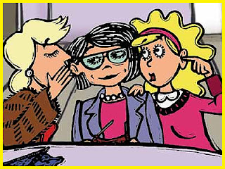
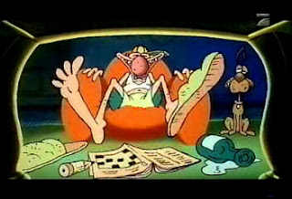
Looking threw the list of animators the list still stayed the same about 1/4 of the animation that looked like limited animation was not. And these few that where more details in animation where lovely.
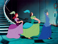
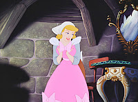
Looking threw the book :Animation now there is the list i made.
- Andreas Hykade
- bruno bozzetto
- buzzco and associates

- federico vitali

- joanna quinn
I soon found not to long after watching them that it is not entirely true. altho 3 of the 5 there limitede animation, Andreas Hykade and Joanna Quinn Realy where not.
Looking threw the list of animators the list still stayed the same about 1/4 of the animation that looked like limited animation was not. And these few that where more details in animation where lovely.
why not have this beauty and style in animation biut with more frames and detail?
Looking at the concept art for Cinderella and it made me wonder. there concept art is so beautiful Why couldn't they have animated it in the style they had drawn it?


I think it might be fun to reanimate a part of the show in there concept art style and see how it affects the feel of the animation.
Subscribe to:
Comments (Atom)


