Friday, 18 January 2013

Animistic: Last milk

This is the First go at my animistic. From showing it to my Supervise and other animators. It was noted that there are to many mid/close shots, making it hard to understand where everyone was going in the store and which detection they are running. Even tho this helps the limited side of the animation is take away from the story and audiences understanding.

To help with this I have been watching the Chase scene in ratatouille
(sorry for the odd Audio this was the best i could find on youtube to show you watch i was watching on my DVD)

From watching this I notist that the shots are normally further away to help the watcher know where the character is. and the Camera kept focusing on the Window exit to keep reminding you what his goal was and where he wanted to go, as well as showing you how much progress he had made running and how long he had till freedom. 

Hopefully this will help greatly in my Re-draft of my storyboards, i am also hoping to do a floor plan at a latter date to help with the lay out and directions my character will be running in the store. 


Thursday, 10 January 2013

Still struggling with a story,

I have got to a hard stage where finding a story fitting to what I want. I wanted something funny and simple. The characters also had to be dynamic and reusable to fit in with animation for television.
Much like the series of an animation on TV such as loony tunes with Bugs bunny and daffy duck. The character can be placed in to any environment and scenario and preform there story with out the Audience asking how or why they got in to this situation.

For help coming up with story I used the word salad to brainstorm an idea. here are them main pages I likes the look of most:


I decided on the Final Drawing Idea or two people fighting over the last bottle of milk in a super market.
I also had the Idea of it being two superheros fighting over the milk in there very day life's when they are not being super hero's. How ever the Re-usability of the characters made me wonder if this was the best of ideas.


I had the Idea of it being one Very fat and short character and the other tall and slender to make a good contrast in characters. I also wanted them both to be very angular and jagged  One based with squares and the other triangles.


Monday, 7 January 2013

Character concepts/story ideas

I have been haveing a hard time comeing up with a good story for the final presentation of what i have learnd... I have had lost of littel ideas and drawn a lot of caracter concepts but nothing solid yet. 


My first idea was a Waiter who is trying his best to serve a very snobby and stubborn customer and evenchily loosing his cool. 

(waiter ideas)


(oquerd customer)
 

I also had the idea of there being a dog in the story makeing the waiter blow his fews but i dont know.... 


My Main story Idea was a chess table of character with the pone falling in love with the king. but they cant be togther untill she runs in to battel and makes it to the other side of the board makeing her a Queen so she can then finaly marry the king.

The story still has a lot of gaps and i dont know if my hart is in to it... and there are A LOT of caracters to desing and have moveing in the background,

This story was also inspired by a Disney short :

Silly Symphony - Music Land


Cinderella Concept art to animation.


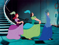
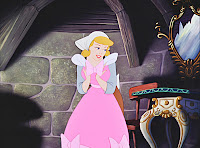
Based on the concept art from Cinderella ( a little lower on my page) I used that to animate a part of the movie. the fameus part where the clock stricks midnight but usething there pritty consent art style like most limited animation, instead of Disney fat and frumpy stereo typed style.

Test animation Smeer line

This is my first try at smudge/zip line it worked very effectively to keep the moment very snappy and quick. it also didn't take long to create a good looking animation.

Wednesday, 2 January 2013

Limited or not limited

Looking at the style of UPA and limited animation. I thought from judging there style i could determent what would and would not be limited animation, before seeing its movment.

Looking threw the book :Animation now there is the list i made.


  • Andreas Hykade 


  • bruno bozzetto
  • buzzco and associates

  • federico vitali


  • joanna quinn


I soon found not to long after watching them that it is not entirely true. altho 3 of the 5 there limitede animation, Andreas Hykade  and Joanna Quinn Realy where not. 

Looking threw the list of animators the list still stayed the same about 1/4 of the animation that looked like limited animation was not. And these few that where more details in animation where lovely. 


why not have this beauty and style in animation biut with more frames and detail? 

Looking at the concept art for Cinderella and it made me wonder. there concept art is so beautiful  Why couldn't they have animated it in the style they had drawn it? 


I think it might be fun to reanimate a part of the show in there concept art style and see how it affects the feel of the animation.